White Nose — Watching a Federal Bat Plague Spread Across America
My girlfriend Natasha rehabilitates bats in Des Moines, Iowa. So when this week's theme landed — go find the boring federal data nobody ever turned into anything, because the government never built an app for it — I knew exactly which dataset I wanted to drag into the light.
What it is
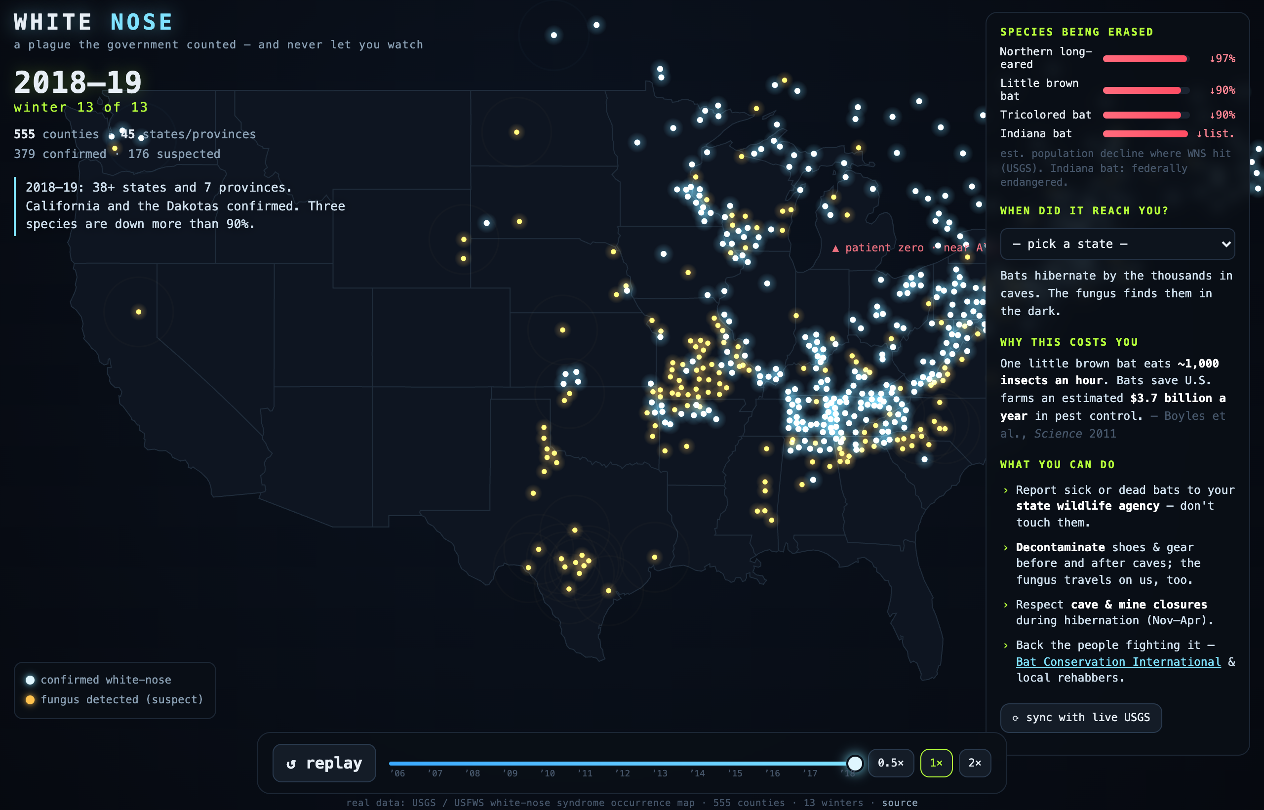
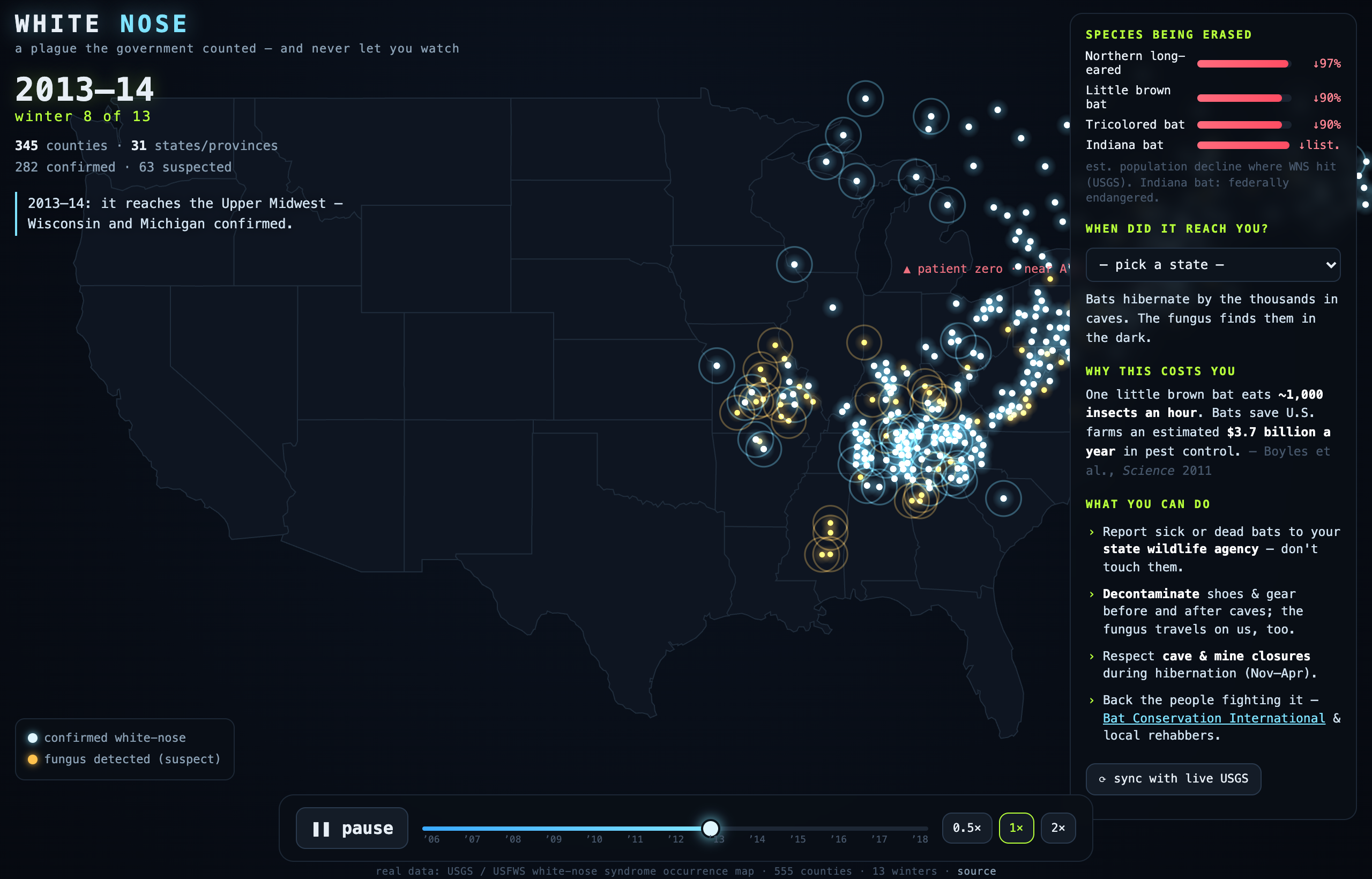
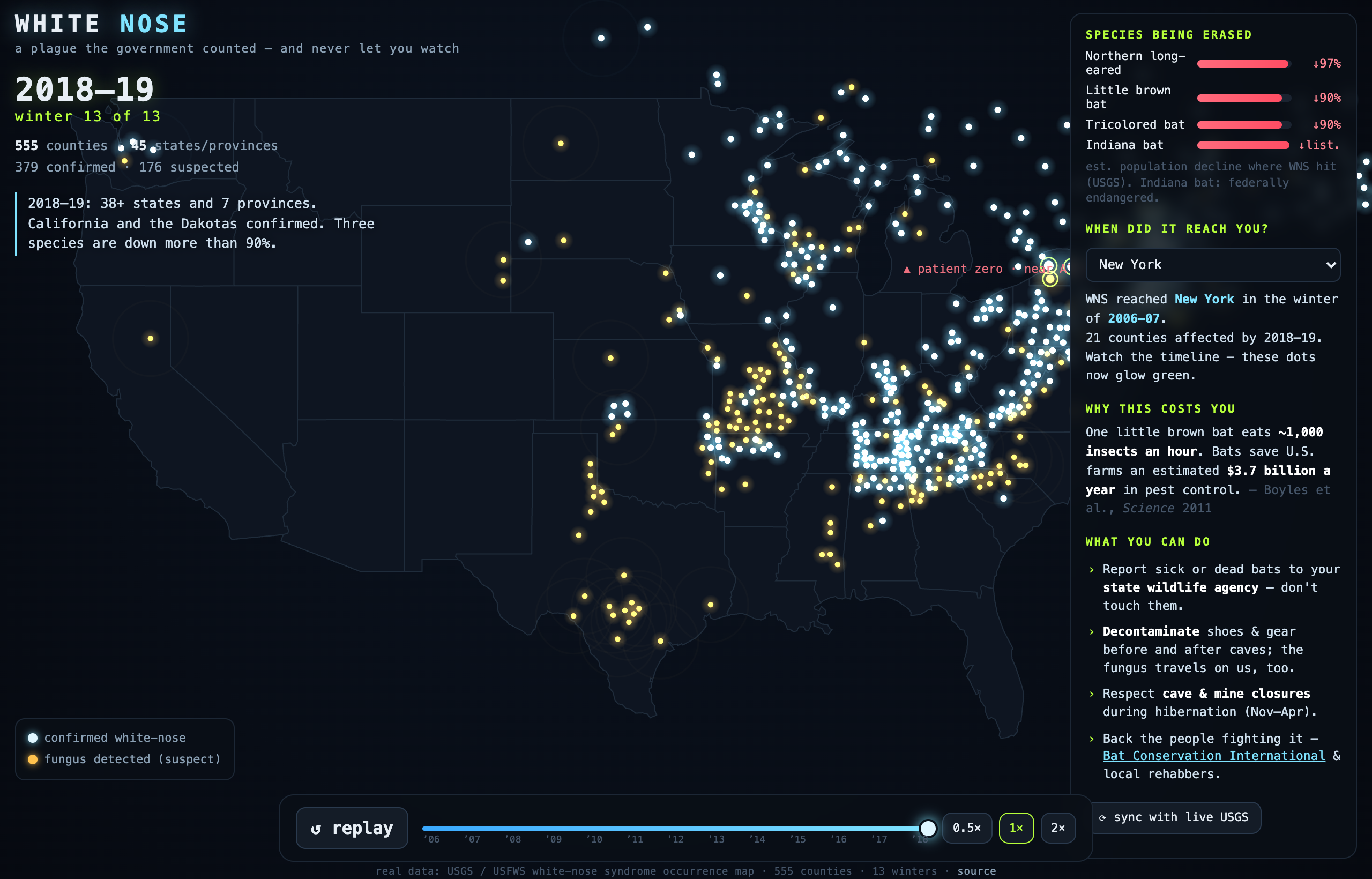
In the winter of 2006, in a cave near Albany, NY, a caver photographed hibernating bats with white fungus on their faces — the first record of white-nose syndrome. In the thirteen winters since, it has crossed the continent and killed millions of bats. The USGS tracked it the whole way, county by county, then left it sitting in GIS layers almost no one ever opens. WHITE NOSE is a single page that lets you watch it spread: press play and each glowing dot is a real county lighting up the winter the disease arrived — out of that one cave, down the Appalachians, into the Midwest, then a 1,300-mile leap to Washington State in 2015–16, then Texas, the Plains, California. Hover any county; pick your state to see when it reached you; a panel tracks the species being erased (three are down more than 90%).
How it’s built
- Real USGS / USFWS occurrence data — 555 counties across 13 hibernation seasons (2006→2019) — baked inline so the page is fully self-contained: no server, no API, no tracking.
- The current county layer had to be dug out of the USGS ArcGIS org: the obvious "time-enabled" service is quietly frozen at 2013-14; the real snapshot (WNS_Counties_20191005) has the other 274 counties and the entire western jump.
- Canvas 2-D with an additive, bioluminescent glow; an animated spread on a scrub-able timeline; county centroids computed from the polygon geometry; and season-by-season narration of the real history (the naming, the fungus, the 5.7 million estimate, the leap west).
On the theme
The theme said it's punk because the government never built apps for this data. This is the literal version of that sentence: the catastrophe is fully counted, fully public, and almost completely unseen — frozen in layers nobody opens. All I did was make the count move. An honest note: the freshest county-level federal release is 2019, so the map runs 2006→2019; the disease has spread further since, but the feds haven't re-published at this resolution. And it isn't abstract for us: pick Iowa and the white reached it in 2014–15 — the bats Natasha treats in Des Moines live in a state this record already turned. This one's for her, and for every wildlife rehabber on the night shift. 🦇 Punk isn't dead. It's compiling.
Try it →Code →All the builds →
Shout-out
Part of the competition is cross-referencing other builders. So: shout-out to Eric Rhea — who set the Data.Punk theme ("go get that 'murica data"). Most "data" builds are a dashboard; I went looking for the federal dataset that turns out to be a quiet apocalypse nobody animated.
Built for Summer Into AI 2026 (Competition #2), hosted by Eric Rhea. More in the build log.