Biosphere — A Living 3-D Earth Built From the Federal Data Nobody Made Beautiful
The U.S. government runs thousands of sensors over this country every minute — rivers, earthquakes, wildfires, the spread of disease, the aurora overhead — and files the readings where almost nobody looks. Biosphere is a living, rotatable 3-D Earth built entirely from that data: the planet, as the instruments actually see it.
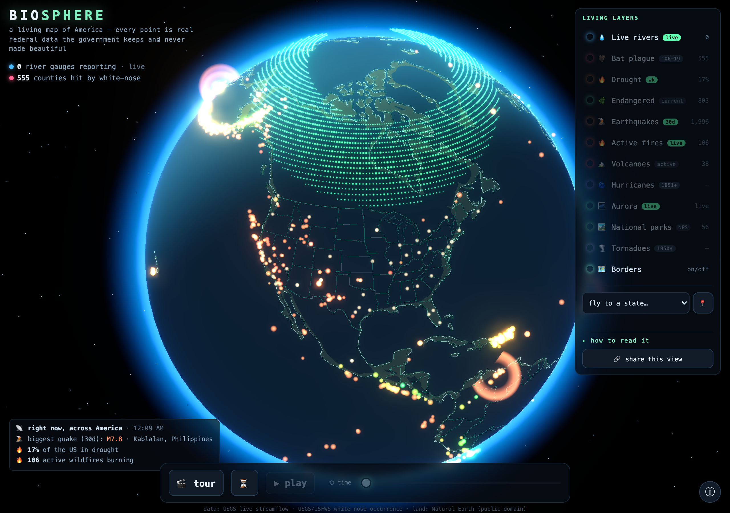
What it is
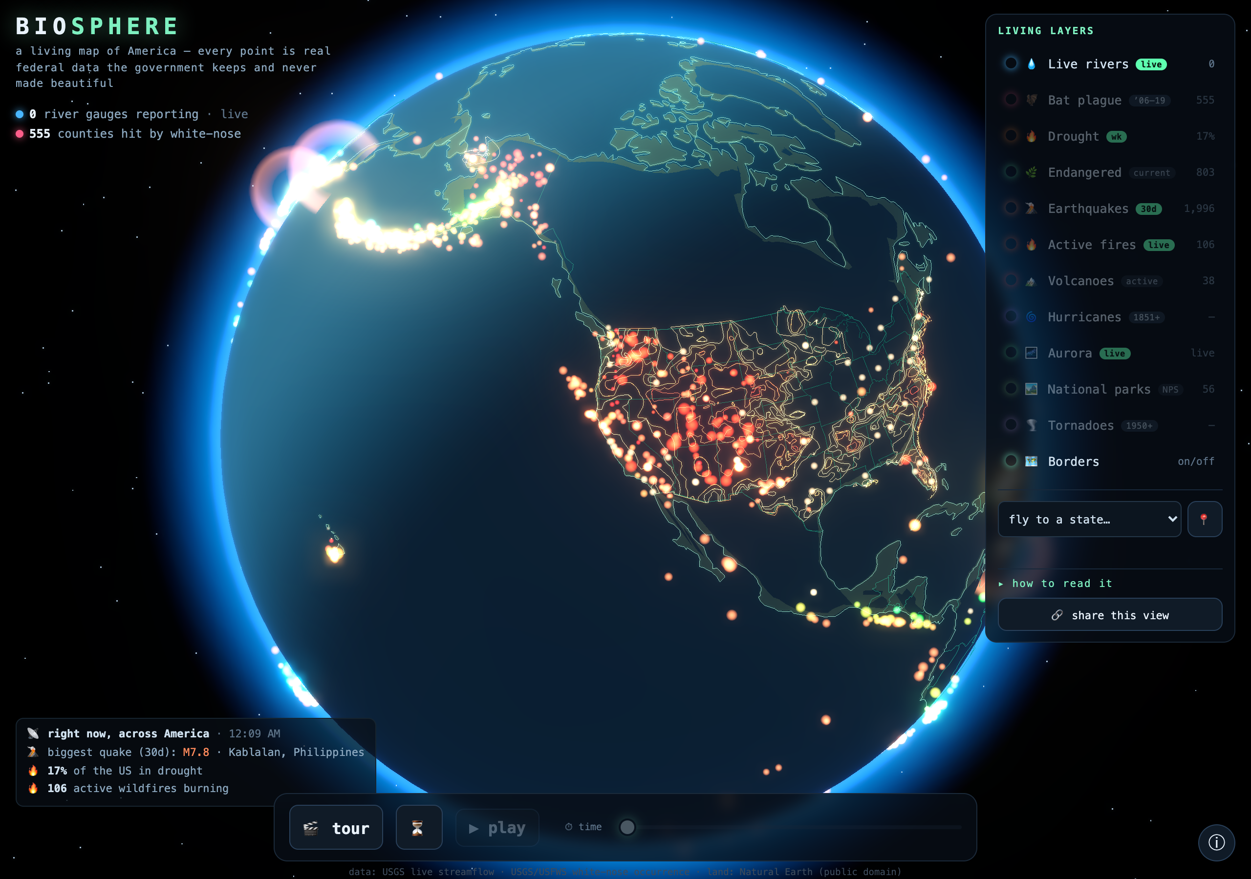
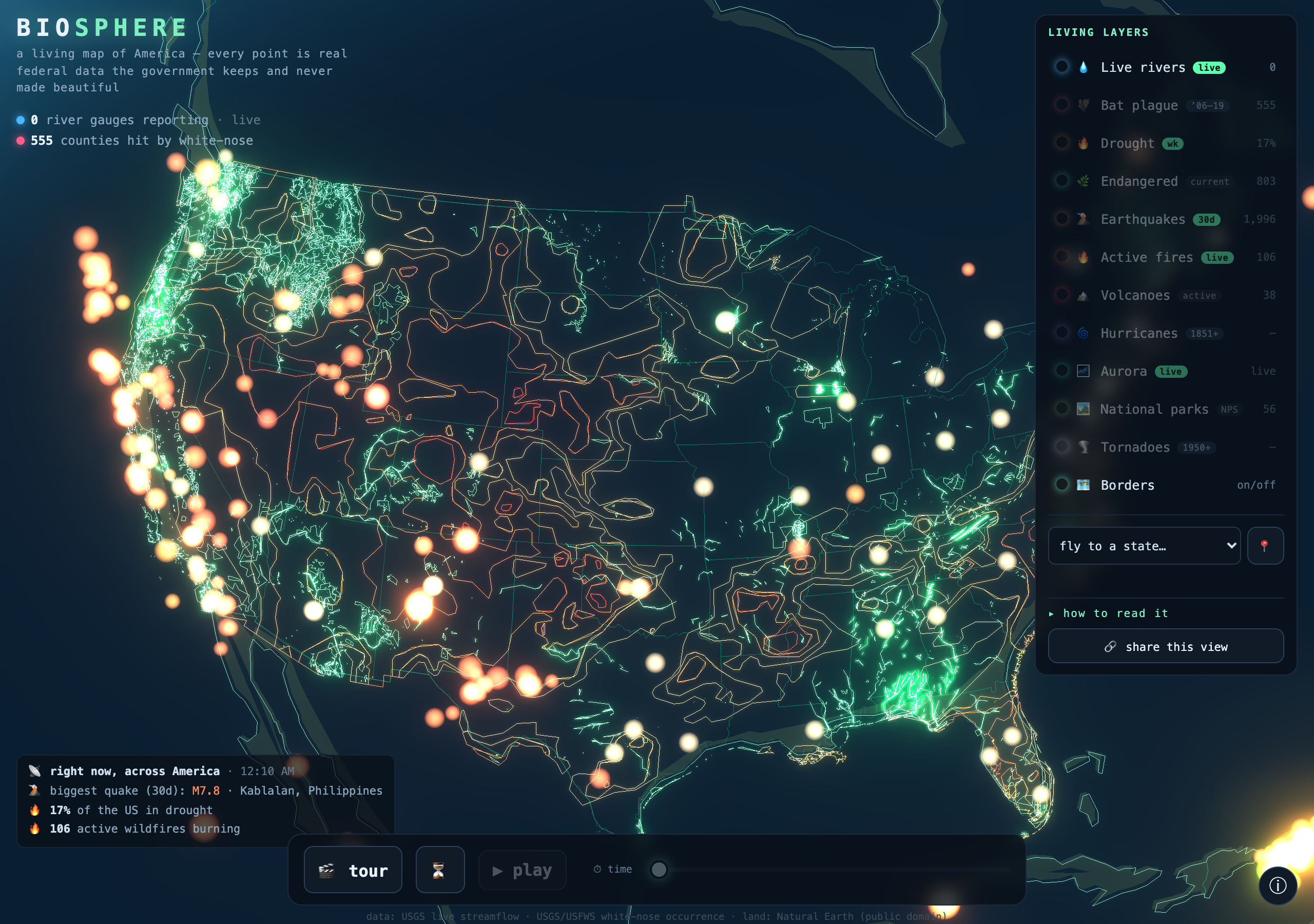
Spin the globe and flip on a living layer: ~9,000 river gauges reporting their flow live from the USGS, the white-nose bat plague, the current drought belt, endangered-species habitat, every earthquake of the last month (the Ring of Fire lights up on its own), active wildfires, volcanoes, a century of hurricane tracks, 36,000 tornadoes, every National Park, and the live aurora from NOAA. It's a real-time day/night Earth with city lights on the dark side, a ⏳ time-machine to scrub a century of storms and quakes, a "fly to your home" readout, a live "right now" ticker, and a one-click cinematic tour.
How it’s built
- A hand-built WebGL globe (Three.js): triangulated day/night continents, atmosphere, starfield, HDR bloom, a real-time sun terminator + city lights, and toggleable coastline/country/state borders.
- 11 layers, ~a dozen live federal feeds fetched in-browser (all CORS): USGS Water Services, USGS/USFWS white-nose, US Drought Monitor, USFWS critical habitat, USGS earthquakes, NIFC wildfires, NOAA HURDAT2 + SPC tornadoes, NOAA SWPC aurora, NPS parks. Light feeds auto-refresh every few minutes.
- Every layer is badged live vs. archival so it's clear what's current; dense point layers are tuned so they read as glowing fields, not white blobs; respects reduced-motion.
On the theme
The theme was go get that 'murica data — and I wanted to argue that the punkest thing you can do with a boring federal dataset isn't a dashboard, it's to make people feel it. The government has an extraordinary, minute-by-minute portrait of this living continent, scattered across a dozen agencies in formats no one opens. I put it all on one globe. This one's for Natasha. 🌎 Punk isn't dead. It's compiling.
Try it →Code →All the builds →
Shout-out
Part of the competition is cross-referencing other builders. So: shout-out to Kyle Sebestyen — whose ambitious 3-D "Boomtown" is what made me stop stacking small builds and go big on one complete project instead. He swung huge; I tried to swing just as hard and land it.
Built for Summer Into AI 2026 (Competition #2), hosted by Eric Rhea. More in the build log.